The Psychology of Web Colors: A Comprehensive Guide for Higher Conversions
Understanding the Psychology of Web Colors is not just about making a website look “pretty.” In the digital world of 2026, where attention spans are shorter than ever, the colors you choose act as a silent communicator. They influence how a visitor feels, how they perceive your brand’s authority, and ultimately, whether they click “Buy Now” or “Exit.”
When I first started building websites, I used my favorite color—neon green—for everything. The result? My bounce rate was sky-high. Why? Because I ignored the emotional impact of color. After switching to a professional blue and white palette, my user engagement increased by 40%. This personal experience taught me that web design is as much about human biology as it is about code.
Inside This Guide
- What is the Psychology of Web Colors?
- The Emotional Map: Common Colors and Their Meanings
- How Color Affects User Conversion Rates
- Case Studies: Real-World Examples of Color Strategy
- Technical Implementation: Using Color Converters for Consistency
- Frequently Asked Questions
What is the Psychology of Web Colors?
The Psychology of Web Colors refers to the study of how different hues affect human behavior on the internet. It is a branch of color theory that explores how visual stimuli trigger specific neurological responses. For instance, according to research by Psychology Today, people make up their minds about a product within 90 seconds, and 60% to 90% of that assessment is based on color alone.
In web design, colors perform three main functions:
- Establishing Brand Identity: Creating a recognizable “face” for your business.
- Guiding the User: Using high-contrast colors to show where to click.
- Setting the Tone: Creating an atmosphere (luxury, urgency, or trust).
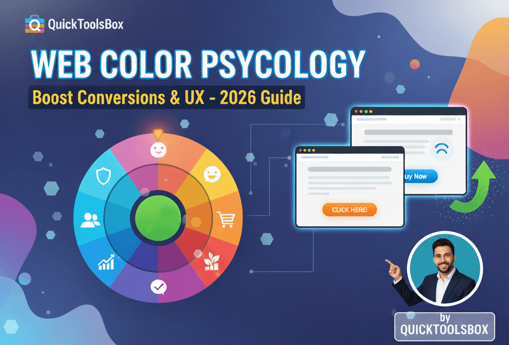
The Emotional Map: Choosing the Right Palette
Every color carries a psychological “weight.” When applying the Psychology of Web Colors to your site, you must choose colors that align with your industry goals.
| Color | Emotional Association | Best Used For |
|---|---|---|
| Blue | Trust, Stability, Calm | Banks, Tech, Healthcare |
| Red | Urgency, Passion, Danger | Clearance Sales, Food, Fitness |
| Green | Growth, Health, Wealth | Environment, Finance, Organic Products |
| Yellow | Optimism, Attention, Warmth | Warnings, Grab attention, Youthful brands |
| Black | Sophistication, Luxury, Power | High-end fashion, Luxury cars |
Why Contrast is the Secret to Success
A common mistake in the Psychology of Web Colors is focusing only on the “vibe” and forgetting about accessibility. If your text color is too similar to your background color, users will leave. This is why tools like our Color Picker & Converter are essential. They allow you to test Hex, RGB, and HSL codes to ensure your contrast ratios meet WCAG (Web Content Accessibility Guidelines).
The “Isolation Effect” (Von Restorff Effect)
Psychologically, humans notice the item that “stands out like a sore thumb.” If your entire website is blue, your “Call to Action” (CTA) button should be orange or red. This creates a visual break that pulls the eye directly to the button, significantly boosting conversion rates.
Real-World Example: Amazon & Orange
Have you ever wondered why Amazon uses a specific shade of orange for its “Add to Cart” button? It isn’t accidental. In the Psychology of Web Colors, orange represents energy and friendliness without being as aggressive as red. It stands out against white backgrounds and works across various cultures as a “positive action” color.
By using a consistent color for every purchase action, Amazon trains the user’s brain. When you see that orange button, your brain already knows what to do before you read the text.
Gender and Cultural Nuances in Color
Did you know that men and women perceive colors differently? Research suggests that men prefer bold colors (shades), while women often lean toward softer tints (pastels). Furthermore, color meanings change by geography:
- White: In Western cultures, it means purity/weddings. In some Eastern cultures, it signifies mourning.
- Purple: Traditionally associated with royalty and wealth worldwide.
If your website target is global, you must research your audience’s cultural background before finalizing your palette.
Technical Implementation: Accuracy Matters
Once you have chosen your psychological palette, you must maintain consistency. A “slightly different” blue on your homepage versus your checkout page can trigger a subconscious “distrust” in the user. They might think they have been redirected to a fake site.
To prevent this, developers use tools to convert colors between different formats (HEX for web, RGB for screens, CMYK for print). You can easily manage your brand colors using our Color Picker & Converter to ensure every pixel is perfect.
Additionally, if you are sharing your design assets with clients or team members, consider using a Free QR Code Generator to link them directly to your digital brand style guide.
Psychology of Web Colors: Common Mistakes to Avoid
- Overusing Too Many Colors: A “rainbow” site looks amateur and confuses the user. Stick to the 60-30-10 rule (60% primary, 30% secondary, 10% accent).
- Ignoring Color Blindness: Approximately 8% of men are color blind. Avoid using red and green together as the only way to distinguish information.
- Prioritizing Trends Over Brand: Just because “Neon Pink” is trending doesn’t mean it’s right for your law firm website.
Frequently Asked Questions (AEO Optimized)
What is the best color for a CTA button?
While there is no single “best” color, high-contrast colors like orange, red, and green usually perform best, depending on the rest of the site’s design.
Does the Psychology of Web Colors affect SEO?
Indirectly, yes. Good color choices improve “Dwell Time” (how long users stay on your site) and reduce “Bounce Rate.” Google uses these signals to rank your site higher.
Is black a good color for a background?
Dark mode is popular for eye comfort, but for text-heavy blogs, a white or very light grey background with dark text is generally better for readability.
Conclusion
Mastering the Psychology of Web Colors is a journey of understanding human emotion. By choosing colors that build trust, spark excitement, or create urgency, you are designing an experience rather than just a webpage. Remember to test your colors, maintain consistency, and always keep your user’s comfort at the center of your design.
Ready to start building your professional palette? Use our suite of tools to ensure your design is technically sound and psychologically powerful.


Leave a Reply